Sunday, April 5, 2020

linear regression in matplotlib in python

Linear regression

This is the topic related to Linear regression using python
In [4]:
from scipy.stats import norm
import matplotlib.pyplot as plt
import numpy as np


page_speeds = np.random.normal(3.0,1.0,1000)
purchase_amount = 100 - (page_speeds + np.random.normal(0,0.1, 1000))*3

plt.scatter(page_speeds,purchase_amount)
Out[4]:
<matplotlib.collections.PathCollection at 0x277ffa83348>
In [5]:
from scipy import stats 

slope, intercept, r_value, p_value, std_err = stats.linregress(page_speeds,purchase_amount)
In [6]:
r_value**2
Out[6]:
0.9904525550737715
In [7]:
import matplotlib.pyplot as plt

def predict(x):
    return slope * x + intercept

fit_line = predict(page_speeds)
plt.scatter(page_speeds,purchase_amount)
plt.plot(page_speeds,fit_line, c='r')
plt.show()

Wednesday, April 1, 2020

seaborn library

Seaborn is a library for making statistical graphics in Python. It is built on top of matplotlib and closely integrated with pandas data structures.
install it before start
pip install seaborn

Example1:


import seaborn as sns
sns.set()
tips = sns.load_dataset("tips")
sns.relplot(x="total_bill", y="tip", col="time",
            hue="smoker", style="smoker", size="size",
            data=tips);

output:

bar chart in datascience using matplotlib in python

import matplotlib.pyplot as plt
import numpy as np

def plot_bar_x():
    # this is for plotting purpose
    index = np.arange(len(label))
    plt.bar(index, no_movies)
    plt.xlabel('Genre', fontsize=5)
    plt.ylabel('No of Movies', fontsize=5)
    plt.xticks(index, label, fontsize=5, rotation=30)
    plt.title('Market Share for Each Genre 1995-2017')
    plt.show()

label = ['Adventure', 'Action', 'Drama', 'Comedy', 'Thriller/Suspense', 'Horror', 'Romantic Comedy', 'Musical',
         'Documentary', 'Black Comedy', 'Western', 'Concert/Performance', 'Multiple Genres', 'Reality']
no_movies = [941,
    854,
    4595,
    2125,
    942,
    509,
    548,
    149,
    1952,
    161,
    64,
    61,
    35,
    5
]

plot_bar_x()

output:

Monday, March 30, 2020

queue in python language

from threading import *
import time
import random
import queue

def produce(q):
    while True:
        item=random.randint(1,100)
        print("producer producing item",item)
        q.put(item)
        print("producer giving notification")
        time.sleep(5)

def consume(q):
    while True:
        print("consumer waiting for updation")
        print("consumer consuming items:",q.get())
        time.sleep(5)
     

q=queue.Queue()
t1=Thread(target=consume,args=(q,))
t2=Thread(target=produce,args=(q,))
t1.start()
t2.start()


example 2:

import queue
q=queue.Queue()#FIFO
q.put(10)
q.put(20)
q.put(15)
q.put(30)
q.put(0)
while not q.empty():
    print(q.get(),end=' ')

output:
10 20 15 30 0

example 3:

import queue
q=queue.LifoQueue()
q.put(10)
q.put(20)
q.put(15)
q.put(30)
q.put(0)
while not q.empty():
    print(q.get(),end=' ')

output:
0 30 15 20 10


example 3:
import queue
q=queue.PriorityQueue()
q.put(10)
q.put(20)
q.put(15)
q.put(30)
q.put(0)
while not q.empty():
    print(q.get(),end=' ')

output:
0 10 15 20 30


Related links
shallow copy

Deep copy in python language

import copy

l1=[10,20,[30,40],50]
#l2=l1.copy()
#it dnot work for list inside another list
l2=copy.deepcopy(l1)

l2[2][0]=70
print("l2:",l2)
print("l1:",l1)

output:
l2: [10, 20, [70, 40], 50]
l1: [10, 20, [30, 40], 50]


related links:

shallow copy in python

shallow copy in python


l1=[10,20,30,40]
l2=l1
l2[2]=70
print("l2:",l2)
print("l1:",l1)

output:
l2: [10, 20, 70, 40]
l1: [10, 20, 70, 40]

example 2:

l1=[10,20,30,40]
l2=l1.copy()

l2[2]=70
print("l2:",l2)
print("l1:",l1)

output:
l2: [10, 20, 70, 40]
l1: [10, 20, 30, 40]

example 3:

import copy

l1=[10,20,[30,40],50]
#l2=l1.copy()
#it dnot work for list inside another list
l2=copy.copy(l1)

l2[2][0]=70
print("l2:",l2)
print("l1:",l1)

output:
l2: [10, 20, [70, 40], 50]
l1: [10, 20, [70, 40], 50]

Sunday, March 29, 2020

labels and colors of the plot of matplotlib in datascience using python

from scipy.stats import norm
import matplotlib.pyplot as plt
import numpy as np

axes = plt.axes()
axes.set_xlim([-5,5])
axes.set_ylim([0,1.0])
axes.set_xticks([-5,-4,-3,-2,-1,0,1,2,3,4,5])
axes.set_yticks([0,0.1,0.2,0.3,0.4,0.5,0.6,0.7,0.8,0.9,1.0])
axes.grid()
plt.xlabel('Greebles')
plt.ylabel('Probility')
plt.plot(x, norm.pdf(x),'b-')
plt.plot(x,norm.pdf(x, 1.0, 0.5), 'g:')
plt.legend(['Sneetches','Gacks'],loc=4)

plt.savefig('C:\\Users\\Onyx1\\Pictures\\matplotlib\\matplot_lables.jpg', format='jpg')
plt.show()

output:

change line types and colors of the plot of matplotlib library in datascience using python

from scipy.stats import norm
import matplotlib.pyplot as plt
import numpy as np

axes = plt.axes()
axes.set_xlim([-5,5])
axes.set_ylim([0,1.0])
axes.set_xticks([-5,-4,-3,-2,-1,0,1,2,3,4,5])
axes.set_yticks([0,0.1,0.2,0.3,0.4,0.5,0.6,0.7,0.8,0.9,1.0])
axes.grid()
plt.plot(x, norm.pdf(x),'b-')
plt.plot(x,norm.pdf(x, 1.0, 0.5), 'g:')

plt.savefig('C:\\Users\\Onyx1\\Pictures\\matplotlib\\matplot_x_y_ticks_bg_grid.jpg', format='jpg')
plt.show()

output:

back ground grid for plots in matplotlib in datascience using python

from scipy.stats import norm
import matplotlib.pyplot as plt
import numpy as np

axes = plt.axes()
axes.set_xlim([-5,5])
axes.set_ylim([0,1.0])
axes.set_xticks([-5,-4,-3,-2,-1,0,1,2,3,4,5])
axes.set_yticks([0,0.1,0.2,0.3,0.4,0.5,0.6,0.7,0.8,0.9,1.0])
axes.grid()
plt.plot(x, norm.pdf(x))
plt.plot(x,norm.pdf(x, 1.0, 0.5))

plt.savefig('C:\\Users\\Onyx1\\Pictures\\matplotlib\\matplot_x_y_ticks_bg_grid.jpg', format='jpg')
plt.show()

output:

Saturday, March 28, 2020

how to set xticks and yticks in matplotlib in datascience using python

from scipy.stats import norm
import matplotlib.pyplot as plt
import numpy as np

axes = plt.axes()
axes.set_xlim([-5,5])
axes.set_ylim([0,1.0])
axes.set_xticks([-5,-4,-3,-2,-1,0,1,2,3,4,5])
axes.set_yticks([0,0.1,0.2,0.3,0.4,0.5,0.6,0.7,0.8,0.9,1.0])
plt.plot(x, norm.pdf(x))
plt.plot(x,norm.pdf(x, 1.0, 0.5))
plt.show()


output:

matplot lib basics for datascience using python

from scipy.stats import norm
import matplotlib.pyplot as plt
import numpy as np


x=np.arange(-3,3,0.001)
plt.plot(x,norm.pdf(x))
plt.show()

output:


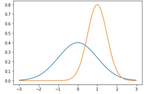
Multiple plots in one diagram:

plt.plot(x,norm.pdf(x))
plt.plot(x,norm.pdf(x,1.0,0.5))
plt.show()


save the plot in file


output:


how to  save the plots in folders:

plt.plot(x,norm.pdf(x))

plt.plot(x,norm.pdf(x,1.0,0.5))

plt.savefig('C:\\Users\\Onyx1\\Pictures\\matplotlib\\matplot_two_plot.jpg', format='jpg')


python class topic video